Introduction
Think Inside Out—what makes each character’s emotion so instantly recognizable? Is it their personality, or their distinct colors, like sadness being the color blue? Color influences how we read emotions long before a character speaks. When sad, have you ever said “I feel blue?” Have you ever seen a color, in art, in nature, in the world and felt an emotion without any words at all? Yet how much of that reaction comes from language, and how much comes from visual perception? Saying “I’m feeling blue” is different from seeing a bright patch of yellow and feeling suddenly lighter. There is also the possibility that language itself shapes what emotions people associate with colors. This brings us to the question of, how does language versus visual perception of color change what a person feels and understands?
To explore this, researchers tested whether people associate different emotions with colors depending on whether the color is presented as a word or as a visual patch. Their goal was to see the extent to which color–emotion relationships come from the experience of seeing and processing a color vs understanding the meanings attached to color terms. Possibly, the connection between the two.
Methods
The study involved 132 first‑year university students in Switzerland, all native French speakers. After screening out color‑blind participants and non‑native speakers, 78 students completed the version of colors as words of the experiment online, while 54 students completed the color patch version in a controlled laboratory setting. To test the relationship between color, emotion, and language, they used 12 colours including red, orange, yellow, green, turquoise, blue, purple, pink, brown, white, grey, and black with corresponding labels. In the patch condition, they carefully chose the hues and tones of the patches to match the colours most typically as the “best examples” of their colors.
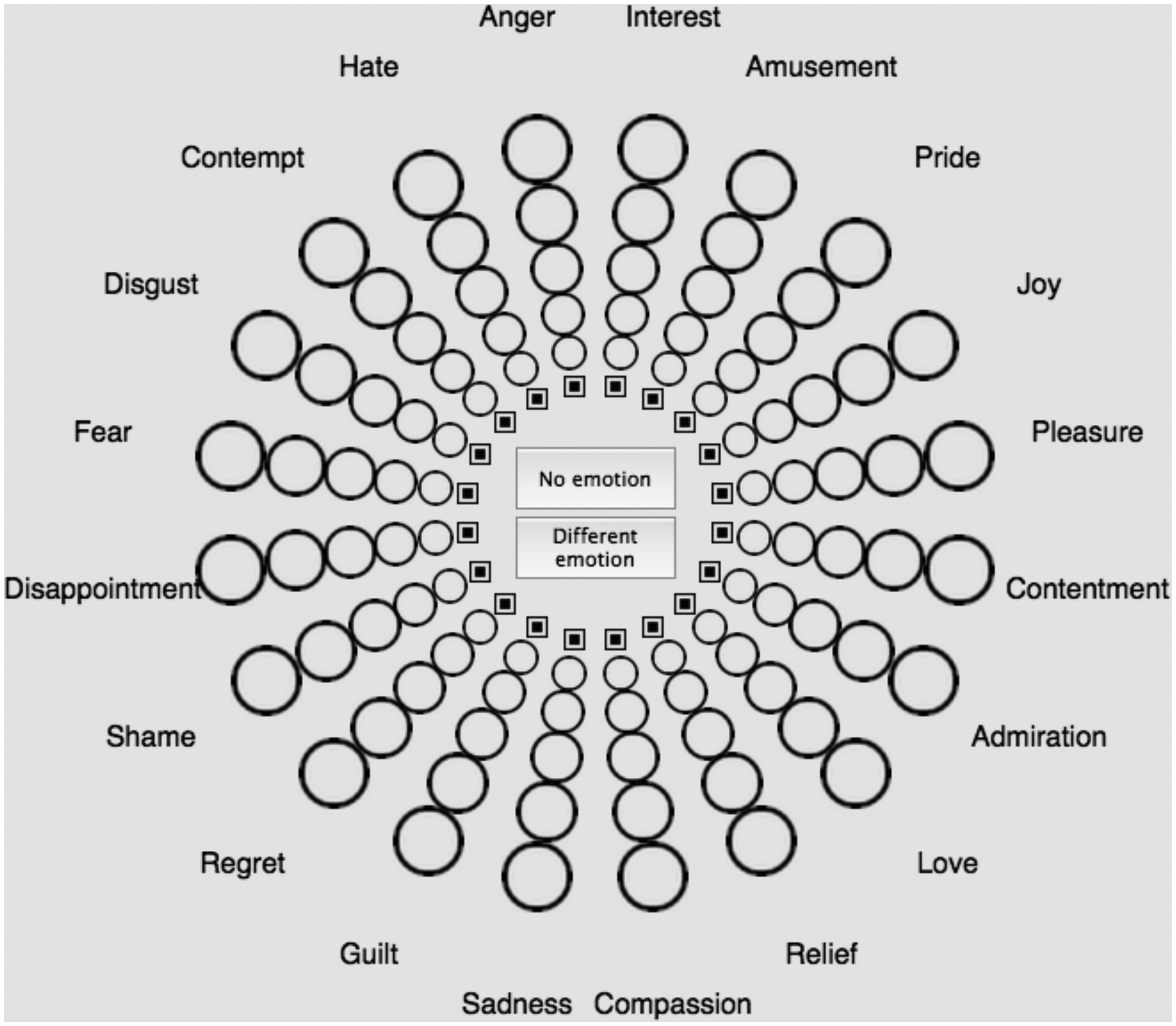
Figure 1. The Geneva Emotion Wheel (GEW)
To measure emotions, the researchers used the Geneva Emotion Wheel (GEW). It includes 20 different emotions arranged around a circle, organized by valence (positive vs. negative) and power (strong vs. weak). This is illustrated in the figure above. Emotions also differ in arousal, meaning how high‑energy or low‑energy they are. For each color, students could choose one, several, or no emotions, and rate how strong each emotion felt on a scale from 1 to 5.
After collecting all the responses, the researchers calculated the proportion of participants who chose each emotion for each color. They then compared the patterns from the term group and the patch group using a Pattern Similarity Index (PSI), which is meant to analyze the similarity between the two sets of results. A PSI of 1 means the patterns are identical; 0 means they’re completely different.
Results
The results were surprisingly clear: color terms and color patches produced almost the same emotional patterns. The overall PSI was r = .82, meaning the emotional associations were highly similar whether participants saw the color as a word or as a visual patch. In simple terms, people tended to associate the same emotions with a color regardless of how it was presented.
However, two colors stood out. Purple showed the biggest difference between terms and patches, with a PSI of r = –.23, meaning the word “purple” led to very different emotional associations than the purple patch. This suggests that purple may carry stronger cultural or linguistic meanings that do not match its visual appearance, or possibly has a higher dependency on the individual’s personal experiences or imagination.
Black also differed noticeably. When shown as a word, black was associated with more negative and more intense emotions than when shown as a color. The study notes that black as a term may evoke stronger cultural meanings, and often in literature and media, and may be associated with darkness and danger. These may intensify emotional responses. As a patch, however, black is simply a dark color lacking those symbolic associations, and its emotional impact appears less severe.
Despite these exceptions, the study found that the overall emotional dimensions of valence, arousal, and power were nearly identical across terms and patches. Positive colors like yellow and blue remained positive, negative colors like black and brown stayed negative, and high‑arousal emotions (like anger) and low‑arousal emotions (like sadness) followed the same patterns in both conditions. It is suggested that people rely on stable color concepts, which blend perception, language, and cultural learning to understand and “feel” colors.
Limitations
One limitation of the study is that it was conducted only on Swiss college students, which means the results may not apply to other cultures, age groups, or linguistic backgrounds. Also, color–emotion associations can vary widely across societies, and younger or older participants might respond differently. The study also used only 12 basic colors, without exploring variations in shade, saturation, or brightness, which may have different effects on emotional reactions. However, how these color-emotion associations are developed could not be answered by this study. Future research should include more diverse populations and a wider range of colors to better understand how color–emotion associations uniquely develop.
Conclusions
Overall, the study shows that color terms and color patches evoke remarkably similar emotional associations, suggesting that people understand color concepts through both visual perception and linguistic cues. While purple and black showed meaningful differences between terms and patches, their broader emotional patterns stayed consistent. This indicates that both language and perception contribute to color–emotion associations, but neither is more important than the other.
These findings help explain why color–emotion links appear so consistently across cultures and contexts. They also highlight the importance of considering both perception and language when studying how humans understand and “feel” color. It is interesting to consider how, throughout literature, art, and music, colors become a way to describe, to feel, and to understand the world through our eyes. Color is almost like a shared emotional language that doesn’t need words at all.